


Rating Scale at a glance
Create a Rating Scale slide
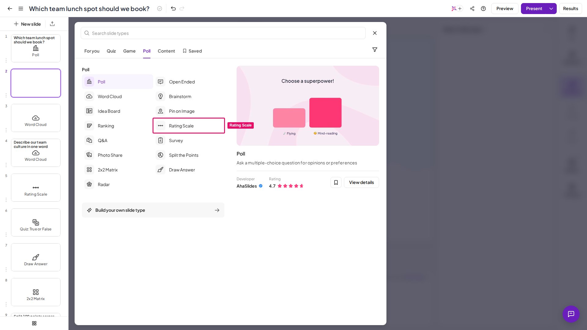
1
Write your question
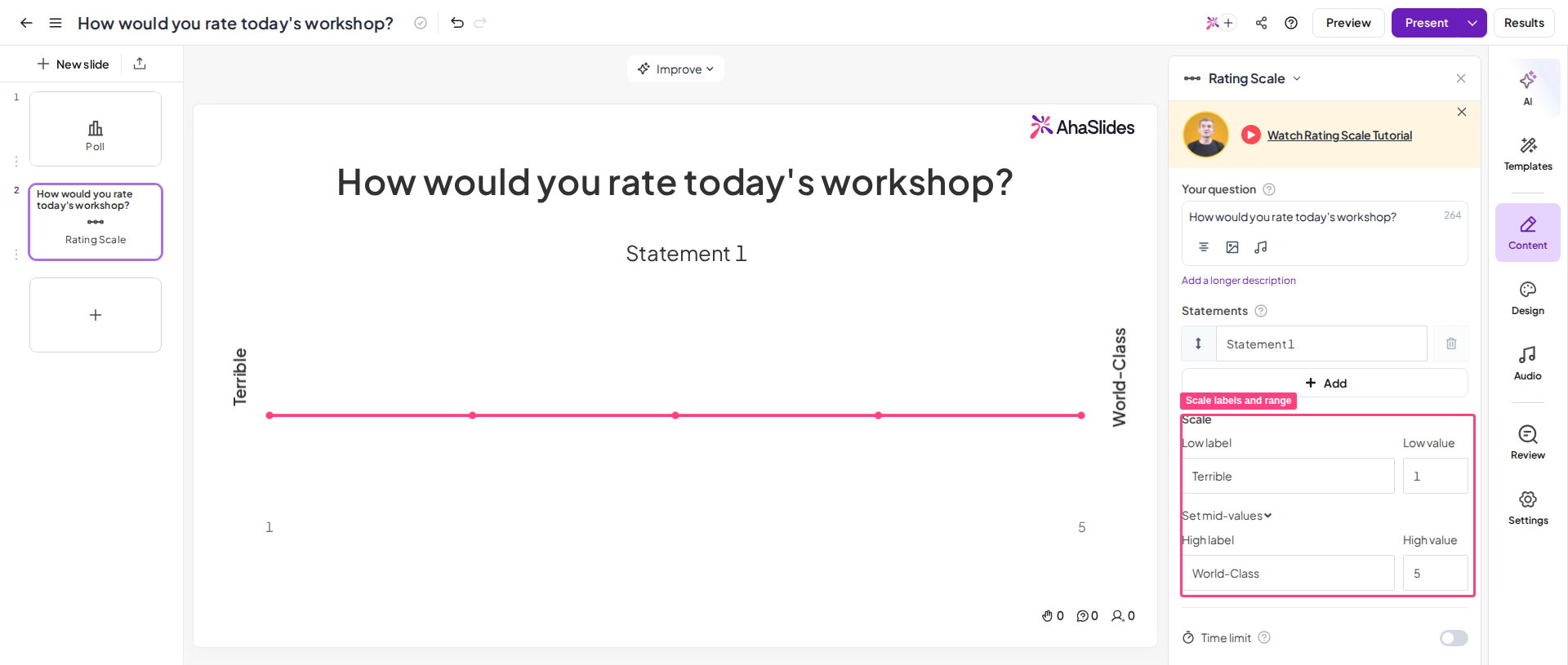
Enter the main question you want to ask your audience. This can invoke an answer on a scale — for example, “How satisfied are you with our service?”, with 1 being very dissatisfied and 5 being very satisfied. It can also be a statement, such as “My experience of this service was highly satisfactory”, with the scale measuring strong disagreement (1) to strong agreement (5).If your question needs clarifying, add a longer description — it appears underneath the question on audience members’ devices.
2
Add statements
Statements are the specific parts of your broad question that you want an answer to. For example, for “How satisfied are you with our service?” you might add statements for different aspects such as “ease of use”, “friendliness of staff”, or “speed of delivery” — up to 8 statements.If your broad question is your statement and you don’t need separate statements, delete all statement boxes. This centralises the layout so your audience responds only to the one question at the top.
3
Configure the scale
Set the wording and number of values on your scale. Values typically run from 1 to 5, but you can widen the range for a more refined answer: the difference between the lowest and highest value can be up to 1,000. The low label and high label appear at either end of the scale on your display, and wording for values in between appears on audience devices — provided the difference between the lowest and highest value is no more than 10.
Present a Rating Scale slide
- The host poses a broad question, adds specific statements related to it, and asks the audience to rate their opinions on each statement using a sliding scale.
- The audience accesses the slide on their phones and responds to each statement via the sliding scale.
- The resulting data appears on a graph showing what and how many responses each statement received, along with the average numbered response for each statement.
Rating Scale results
The graph shows all responses across all statements, colour-coded by statement so you can see exactly how audience members responded to each one. Average performance for each statement appears in the colour-coded circles at the bottom of the graph. Enable show the average line for all statements in other settings to see the combined average across all statements, shown as a white circle below the individual averages. Hover over each circle to see how many responses each value received, or hover over a statement — or its circle average — for an isolated view of how that statement fared.Rating Scale settings
Have a question?
Contact our support team — if you’re logged in, use the chat bubble in the bottom-right of your dashboard; otherwise contact us here or email hi@ahaslides.com.
Want to connect with other users? Join the AhaSlides community to share tips, request features, and see how others engage their audiences.