

2×2 Matrix at a glance
Create a 2×2 Matrix slide
1
Add the slide
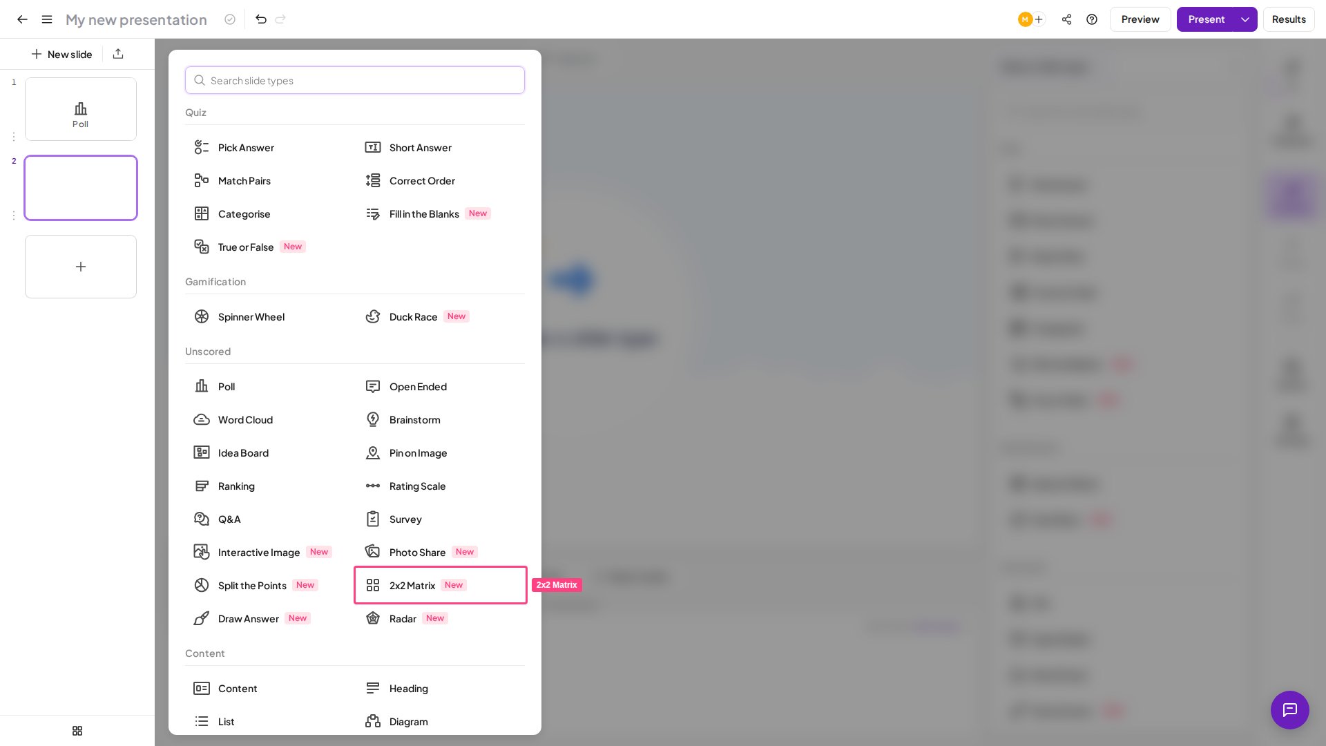
In the editor, click New slide (top-left) and select 2×2 Matrix from the Poll tab of the slide type picker.
2
Write your question
Click into the slide’s title field and type the prompt your audience will answer — for example, “Where does each idea land?” or “Rate these brands.” Keep it clear, since it frames how people read the grid.
3
Name your two axes
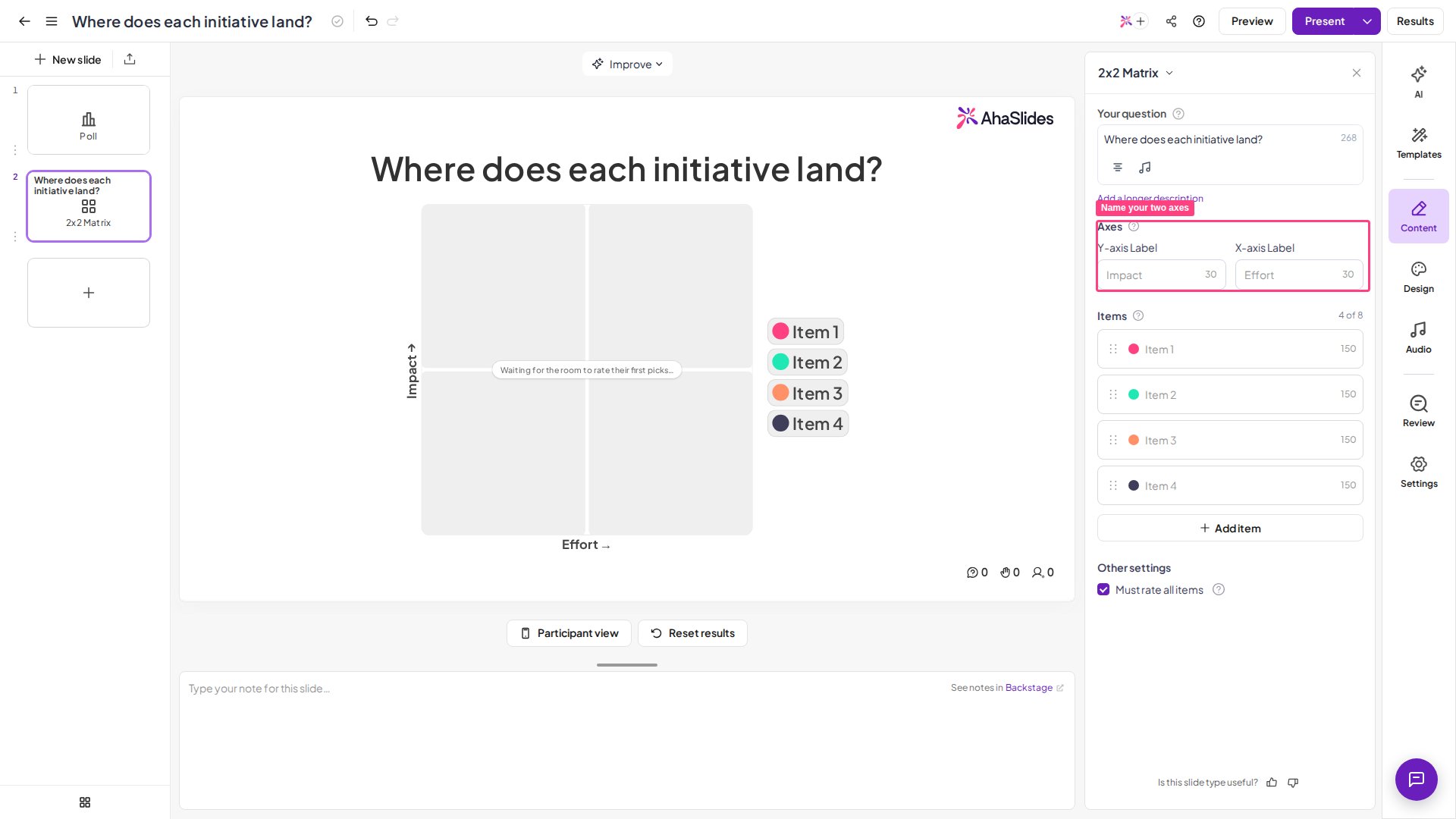
In the settings panel, under Axes, fill in the two axis labels: Y-axis Label (the vertical scale, bottom to top) and X-axis Label (the horizontal scale, left to right), up to 30 characters each. Leave them blank and they default to Impact (Y) and Effort (X), the classic prioritization pairing. The quadrant labels on the results screen are composed automatically from these names, so a clear pair of axes makes the outcome easy to read.
4
Add the items to place
List the items you want the room to rate — a minimum of 1 and up to 8. Each item is automatically assigned its own colour from the brand palette so it stands out on the grid, and you can reorder or remove items as needed. An empty row shows a suggested placeholder to hint at the format.
5
Adjust the response settings
Under Other settings, the Must rate all items checkbox (on by default) controls skipping. Left checked, participants must place every item before they can submit. Uncheck it to let people Skip an item that doesn’t apply — skipped items carry no placement and are left out of the tally. Each participant’s placements are remembered on their device, so navigating away and back won’t ask them to rate twice.
Present a 2×2 Matrix slide
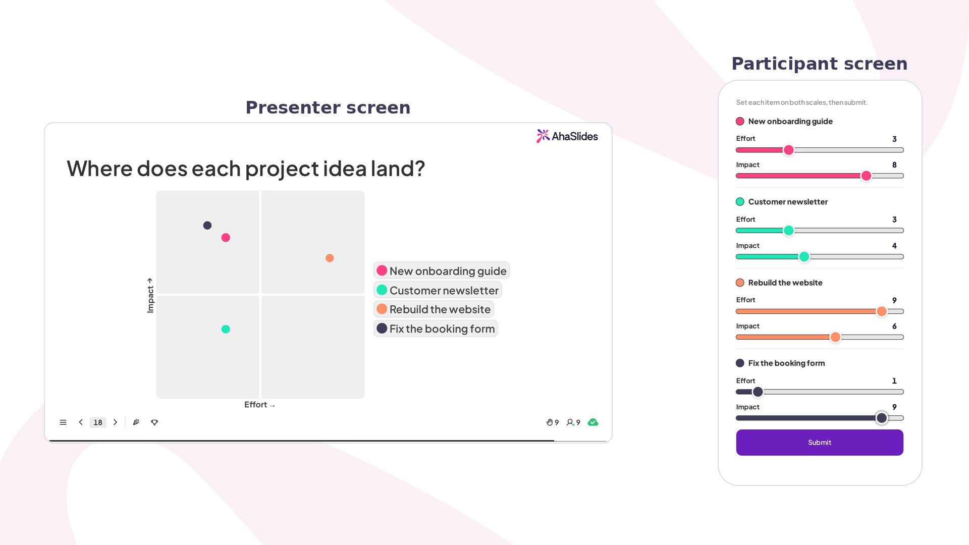
Click Preview in the top header to rehearse the slide before going live — no participants needed. You’ll see both the presenter view (the four-quadrant grid) and the participant view (the two-slider cards on a phone screen). When you’re ready, click Present. Participants join at the access code shown on screen, and their placements populate your grid live as coloured dots. On their phones, participants work through your items one at a time. Each item gets its own card with two sliders — one for each axis, running 0–10 — both starting in the middle. They drag each slider to set where that item sits, then hit Submit (“Set each item on both scales, then submit.”). If skipping is allowed, anything that doesn’t apply can be passed over with Skip. A confirmation (“Your grid is in”) closes the loop, and their placements are remembered on the device so they aren’t asked to rate the same items twice. On your presenter screen, the placements aggregate live: each item appears as a single coloured dot positioned at the average of everyone’s ratings, with a colour-keyed legend, quadrant labels built from your axis names, and a running response count. As more people submit, each dot settles toward the room’s consensus.Getting the 2×2 Matrix results as data
The presenter grid shows each item at the average of everyone’s placements, not the individual submissions behind it. To pull every participant’s raw response, export your presentation data to Excel after presenting. Each person’s submission lands on the Opinion Answers sheet, recording the exact position they set on both axes for every item — the raw data behind the dots on your grid.2×2 Matrix settings
Ideas for using the 2×2 Matrix
The 2×2 Matrix earns its place the moment a second dimension matters. If you only care about one scale, a poll or a rating scale will do — but when two things have to be weighed together, the grid is what turns a fuzzy debate into a picture everyone can see.Product and Business Teams
Plot ideas on Impact × Effort and the quick wins surface on their own: high impact, low effort, one corner, done. High-effort, low-impact items sink to the opposite corner where they belong. This is the classic prioritization use, and usually the first one teams reach for.
Trainers and Workshops
Run the famous Eisenhower matrix live with Urgency × Importance and a list of real tasks. Instead of just hearing about the framework, the room applies it to their own work — which is what makes it stick.
Teachers and Lecturers
Ask students to place items on axes like Size × Speed (cheetah, elephant, snail, falcon) and the comparison turns visual. When the class disagrees about where something goes, that disagreement is the discussion starting.
Marketing and Strategy
Build a perceptual map with Price × Quality and have the room rate a set of brands. You see how your audience really pictures each one against the others — and the result sometimes surprises you.
Risk and Option Checks
Assess choices on Risk × Reward to put two dimensions people usually judge separately side by side. It suits finance, planning, and strategy calls where the safe-but-boring option needs a fair face-off against the risky-but-shiny one.
Fun and Team Building
Two scales at once is exactly what makes these playful, because the gaps between where people land become the joke. Try Rate the boss (Easy-going × Generous), Rate the snacks (Healthy × Tasty), Rate the team trip ideas (Relaxing × Adventurous), Rate our meetings (Useful × Long), or Rate remote-work habits (Camera on × On time). Everyone spots themselves in one corner — no comment.