

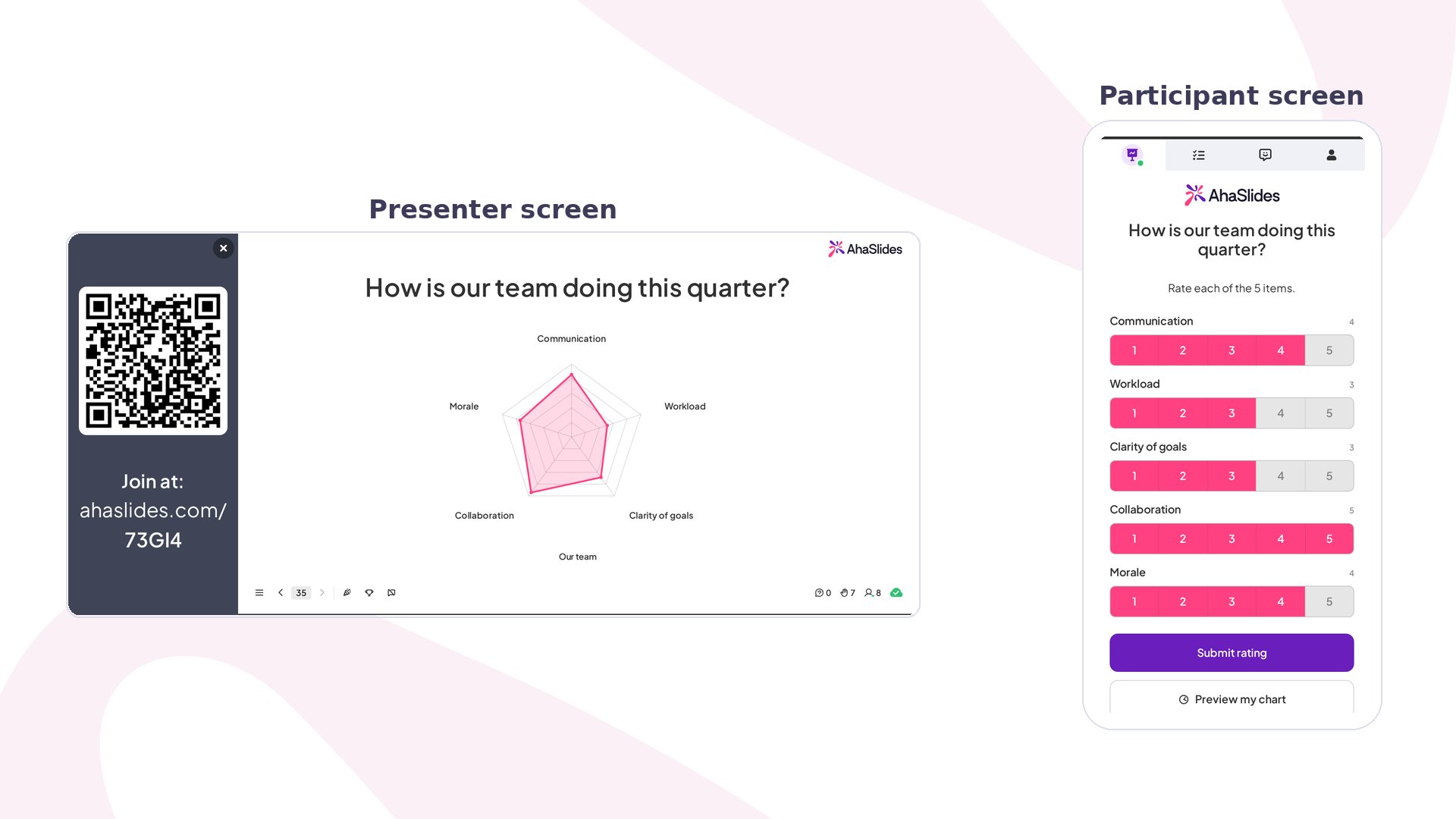
How it works
Each spoke of the chart is a dimension, one criterion you want rated (for example “Communication” or “Ease of use”). Participants rate every dimension on the same scale and submit once. The presenter chart plots the average for each dimension and updates as more ratings arrive. You can also compare up to three subjects on the same axes, such as two product ideas or this quarter against last. Each subject draws its own coloured outline, so the shapes overlap and the differences stand out.How to create a successful Radar slide
1
Add the slide
In the editor, click New slide and select Radar from the Unscored section of the slide type picker.
2
Ask one clear question
Type your question into the slide’s title field, for example “How is our team doing this quarter?”. You can also upload an image and choose whether it sits to the Left or Right of the chart with Image position.
3
Set your dimensions
Under Rating dimensions, list between 3 and 8 criteria, up to 24 characters each. Use Add dimension for more. Five or six short, distinct labels read best; if two dimensions mean nearly the same thing, merge them.
4
Or let AI suggest them
Under Suggest with AI, describe a topic (for example “our new mobile app”), choose how many dimensions you want, and click Generate. Once you’ve edited the list, the button becomes Replace, and its drop-down arrow lets you add more dimensions to the list instead of overwriting it. If your topic names two or three things to compare, AI fills in the subjects too.
5
Add subjects to compare (optional)
Under Subjects, name what’s being rated and click Add subject to compare up to three side by side. Leave a single subject for a straightforward one-shape chart.
6
Pick a rating scale
Under Rating scale, choose 1–5, 1–10 or 0–100%. The scale applies to every dimension. Pick 1–5 for a fast gut check and 1–10 or 0–100% when finer differences matter.
Customising the chart
Open Advanced at the bottom of the settings panel to change how the results look:- Reveal pattern — choose how the shape animates in: Bloom, Crystallise, Pinwheel, Vortex or Radar sweep. Motion, timing, direction, order and reveal front can be fine-tuned under Reveal.
- Rating flow — shown only when you compare two or more subjects. One dimension at a time puts every subject on the same page for each criterion; One subject at a time shows all dimensions for one subject, with a Next button to move on to the next subject.
- Grid shape — the rings behind the chart: Polygon, Circle or None, plus a Ring style of Plain, Zebra or Hidden when a grid is shown.
- Hollow centre — leaves a gap in the middle instead of meeting at a point.
- Scores — shows each dimension’s average as a number on the chart, styled as a Chip, Colour or Muted.
Presenting
Click Preview in the top header to try the presenter chart and the participant rating screen side by side before going live. When you present, participants join at the access code on screen. On their phones, participants rate each dimension, can tap Preview my chart to see the shape they’re about to send, then tap Submit rating. The chart on the big screen animates in with the first rating and settles into the room’s averages as more come in.Where Radar works best
Meetings and retrospectives
- Team health check — rate Communication, Workload, Clarity of goals, Collaboration and Morale on 1–5, then talk about the spoke that pulls in furthest.
- Retrospective — compare This sprint against Last sprint as two subjects to see what improved.
Training and workshops
- Skills self-assessment — learners rate their own confidence on each skill at the start of a course, then again at the end.
- Session review — close a workshop by rating Content, Pace, Relevance and Trainer on 1–10.
Product and events
- Product feedback — let AI suggest criteria for “our new mobile app” and have beta users rate each one.
- Supplier or venue scorecard — overlay up to three options as subjects and let the room compare them on the same criteria.